Exploring Data with Python
In [47]:
%%HTML
<iframe width="560" height="315" src="https://www.youtube.com/embed/WHdblAQHBms" frameborder="0" allow="autoplay; encrypted-media" allowfullscreen></iframe>
MATHEMATICAL GOALS
- Explore data based on a single variable
- Use summary descriptive statistics to understand distributions
- Introduce basic exploratory data analysis
PYTHON GOALS
- Introduce basic functionality of Pandas DataFrame
- Use Seaborn to visualize data
- Use Markdown cells to write and format text and images
MATERIALS
Introduction to the Jupyter Notebook
The Jupyter notebook has cells that can be used either as code cells or as markdown cells. Code cells will be where we execute Python code and commands. Markdown cells allow us to write and type, in order to further explain our work and produce reports.
Markdown
Markdown is a simplified markup language for formating text. For
example, to make something bold, we would write **bold**. We can
produce headers, insert images, and perform most standard formatting
operations using markdown. Here is a markdown
cheatsheet.
We can change a cell to a markdown cell with the toolbar, or with the
keyboard shortcut ctrl + m + m. Create some markdown cells below,
using the cheatsheet that has:
- Your first and last name as a header
- An ordered list of the reasons you want to learn Python
- A blockquote embodying your feelings about mathematics
Libraries and Jupyter Notebook
Starting with Python it’s important to understand how the notebook and Python work together. For the most part, we will not be writing all our code from scratch. There are powerful existing libraries that we can make use of with ready made functions that can accomplish most everything we’d want to do. When using a Jupyter notebook with with Python, we have to import any library that will be used. Each of the libraries we use today has a standard range of applications:
- ``pandas``: Data Structure library, structures information in rows and columns and helps you rearrange and navigate the data.
- ``numpy``: Numerical library, performs many mathematical
operations and handles arrays. Pandas is actually built on top of
numpy, we will use it primarily for generates arrays of numbers and basic mathematical operations. - ``matplotlib``: Plotting Library, makes plots for many situations and has deep customization possibilities. Useful in wide variety of contexts.
- ``seaborn``: Statistical plotting library. Similar to
matplotlibin that it is a plotting library,seabornproduces nice visualizations eliminating much of the work necessary for producing similar visualizations withmatplotlib.
To import the libraries, we will write
import numpy as np
and hit shift + enter to execute the cell. This code tells the
notebook we want to have the numpy library loaded, and when we want
to refer to a method from numpy we will preface it with np. For
example, if we wanted to find the cosine of 10, numpy has a cosine
function, and we write:
np.cos(10)
If we have questions about the function itself, we can use the help function by including a question mark at the end of the function.
np.cos?
A second example from seaborn involves loading a dataset that is
part of the library call “tips”.
sns.load_dataset("tips")
Here, we are calling something from the Seaborn package (sns), using
the load_dataset function, and the dataset we want it to load is
contained in the parenthesis.("tips")
In [1]:
%matplotlib inline
import matplotlib.pyplot as plt
import numpy as np
import pandas as pd
import seaborn as sns
In [2]:
np.cos(10)
Out[2]:
-0.83907152907645244
In [3]:
np.cos?
In [4]:
tips = sns.load_dataset("tips")
In [ ]:
#save the dataset as a csv file
tips.to_csv('data/tips.csv')
Pandas Dataframe
The Pandas library is the standard Python data structure library. A
DataFrame is an object similar to that of an excel spreadsheet,
where there is a collection of data arranged in rows and columns. The
datasets from the Seaborn package are loaded as Pandas DataFrame
objects. We can see this by calling the type function. Further, we
can investigate the data by looking at the first few rows with the
head() function.
This is an application of a function to a pandas object, so we will write
tips.head()
If we wanted a different number of rows displayed, we could input this
in the (). Further, there is a similar function tail() to
display the end of the DataFrame.
In [5]:
type(tips)
Out[5]:
pandas.core.frame.DataFrame
In [6]:
#look at first five rows of data
tips.head()
Out[6]:
| total_bill | tip | sex | smoker | day | time | size | |
|---|---|---|---|---|---|---|---|
| 0 | 16.99 | 1.01 | Female | No | Sun | Dinner | 2 |
| 1 | 10.34 | 1.66 | Male | No | Sun | Dinner | 3 |
| 2 | 21.01 | 3.50 | Male | No | Sun | Dinner | 3 |
| 3 | 23.68 | 3.31 | Male | No | Sun | Dinner | 2 |
| 4 | 24.59 | 3.61 | Female | No | Sun | Dinner | 4 |
In [7]:
#look at first five rows of total bill column
tips["total_bill"]
Out[7]:
0      16.99
1      10.34
2      21.01
3      23.68
4      24.59
5      25.29
6       8.77
7      26.88
8      15.04
9      14.78
10     10.27
11     35.26
12     15.42
13     18.43
14     14.83
15     21.58
16     10.33
17     16.29
18     16.97
19     20.65
20     17.92
21     20.29
22     15.77
23     39.42
24     19.82
25     17.81
26     13.37
27     12.69
28     21.70
29     19.65
       ...
214    28.17
215    12.90
216    28.15
217    11.59
218     7.74
219    30.14
220    12.16
221    13.42
222     8.58
223    15.98
224    13.42
225    16.27
226    10.09
227    20.45
228    13.28
229    22.12
230    24.01
231    15.69
232    11.61
233    10.77
234    15.53
235    10.07
236    12.60
237    32.83
238    35.83
239    29.03
240    27.18
241    22.67
242    17.82
243    18.78
Name: total_bill, Length: 244, dtype: float64
In [8]:
tips["total_bill"].head()
Out[8]:
0    16.99
1    10.34
2    21.01
3    23.68
4    24.59
Name: total_bill, dtype: float64
In [9]:
#find the mean of the tips column
tips["tip"].mean()
Out[9]:
2.9982786885245902
In [10]:
tips["tip"].median()
Out[10]:
2.9
In [11]:
tips["tip"].mode()
Out[11]:
0    2.0
dtype: float64
In [12]:
tips["smoker"].unique()
Out[12]:
[No, Yes]
Categories (2, object): [No, Yes]
In [13]:
#groups the dataset by the sex column
group = tips.groupby("sex")
In [14]:
group.head()
Out[14]:
| total_bill | tip | sex | smoker | day | time | size | |
|---|---|---|---|---|---|---|---|
| 0 | 16.99 | 1.01 | Female | No | Sun | Dinner | 2 |
| 1 | 10.34 | 1.66 | Male | No | Sun | Dinner | 3 |
| 2 | 21.01 | 3.50 | Male | No | Sun | Dinner | 3 |
| 3 | 23.68 | 3.31 | Male | No | Sun | Dinner | 2 |
| 4 | 24.59 | 3.61 | Female | No | Sun | Dinner | 4 |
| 5 | 25.29 | 4.71 | Male | No | Sun | Dinner | 4 |
| 6 | 8.77 | 2.00 | Male | No | Sun | Dinner | 2 |
| 11 | 35.26 | 5.00 | Female | No | Sun | Dinner | 4 |
| 14 | 14.83 | 3.02 | Female | No | Sun | Dinner | 2 |
| 16 | 10.33 | 1.67 | Female | No | Sun | Dinner | 3 |
In [15]:
group.first()
Out[15]:
| total_bill | tip | smoker | day | time | size | |
|---|---|---|---|---|---|---|
| sex | ||||||
| Male | 10.34 | 1.66 | No | Sun | Dinner | 3 |
| Female | 16.99 | 1.01 | No | Sun | Dinner | 2 |
In [16]:
smoker = tips.groupby("smoker")
In [17]:
smoker.first()
Out[17]:
| total_bill | tip | sex | day | time | size | |
|---|---|---|---|---|---|---|
| smoker | ||||||
| Yes | 38.01 | 3.00 | Male | Sat | Dinner | 4 |
| No | 16.99 | 1.01 | Female | Sun | Dinner | 2 |
In [18]:
group.last()
Out[18]:
| total_bill | tip | smoker | day | time | size | |
|---|---|---|---|---|---|---|
| sex | ||||||
| Male | 17.82 | 1.75 | No | Sat | Dinner | 2 |
| Female | 18.78 | 3.00 | No | Thur | Dinner | 2 |
In [19]:
group.sum()
Out[19]:
| total_bill | tip | size | |
|---|---|---|---|
| sex | |||
| Male | 3256.82 | 485.07 | 413 |
| Female | 1570.95 | 246.51 | 214 |
In [20]:
group.mean()
Out[20]:
| total_bill | tip | size | |
|---|---|---|---|
| sex | |||
| Male | 20.744076 | 3.089618 | 2.630573 |
| Female | 18.056897 | 2.833448 | 2.459770 |
As shown above, we can refer to specific elements of a DataFrame in a variety of ways. For more information on this, please consult the Pandas Cheatsheet here. Use the cheatsheet, google, and the help functions to perform the following operations.
PROBLEMS: SLICE AND DICE DATAFRAME
- Select Column: Create a variable named
sizethat contains the size column from the tips dataset. Use Pandas to determine how many unique values are in the column, i.e. how many different sized dining parties are a part of this dataset. - Select Row: Investigate how the
pd.locandpd.ilocmethods work to select rows. Use each to select a single row, and a range of rows from the tips dataset. - Groupby: As shown above, we can group data based on labels, and
perform statistical operations within these groups. Use the
groupbyfunction to determine whether smokers or non-smokers gave better tips on average. - Pivot Table: A Pivot Table takes rows and spreads them into columns. Try entering:
tips.pivot(columns='smoker', values='tip').describe()
What other way might you split rows in the data to make comparisons?
In [21]:
size = tips["size"]
In [22]:
size.head()
Out[22]:
0    2
1    3
2    3
3    2
4    4
Name: size, dtype: int64
In [23]:
tips.iloc[4:10]
Out[23]:
| total_bill | tip | sex | smoker | day | time | size | |
|---|---|---|---|---|---|---|---|
| 4 | 24.59 | 3.61 | Female | No | Sun | Dinner | 4 |
| 5 | 25.29 | 4.71 | Male | No | Sun | Dinner | 4 |
| 6 | 8.77 | 2.00 | Male | No | Sun | Dinner | 2 |
| 7 | 26.88 | 3.12 | Male | No | Sun | Dinner | 4 |
| 8 | 15.04 | 1.96 | Male | No | Sun | Dinner | 2 |
| 9 | 14.78 | 3.23 | Male | No | Sun | Dinner | 2 |
In [24]:
tips.loc[tips["smoker"]=="Yes"].mean()
Out[24]:
total_bill    20.756344
tip            3.008710
size           2.408602
dtype: float64
In [25]:
tips.pivot(columns='smoker', values='tip').describe()
Out[25]:
| smoker | Yes | No |
|---|---|---|
| count | 93.000000 | 151.000000 |
| mean | 3.008710 | 2.991854 |
| std | 1.401468 | 1.377190 |
| min | 1.000000 | 1.000000 |
| 25% | 2.000000 | 2.000000 |
| 50% | 3.000000 | 2.740000 |
| 75% | 3.680000 | 3.505000 |
| max | 10.000000 | 9.000000 |
In [26]:
tips.describe()
Out[26]:
| total_bill | tip | size | |
|---|---|---|---|
| count | 244.000000 | 244.000000 | 244.000000 |
| mean | 19.785943 | 2.998279 | 2.569672 |
| std | 8.902412 | 1.383638 | 0.951100 |
| min | 3.070000 | 1.000000 | 1.000000 |
| 25% | 13.347500 | 2.000000 | 2.000000 |
| 50% | 17.795000 | 2.900000 | 2.000000 |
| 75% | 24.127500 | 3.562500 | 3.000000 |
| max | 50.810000 | 10.000000 | 6.000000 |
Vizualizing Data with Seaborn
Visualizing the data will help us to see larger patterns and structure within a dataset. We begin by examining the distribution of a single variable. It is important to note the difference between a quantitative and categorical variable here. One of our first strategies for exploring data will be to look at a quantitative variable grouped by some category. For example, we may ask the questions:
- What is the distribution of tips?
- Is the distribution of tips different across the category gender?
- Is the distribution of tip amounts different across the category smoker or non-smoker?
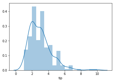
We will use the ``seaborn`` library to visualize these
distributions. To explore a single distribution we can use the
distplot function. For example, below we visualize the tip amounts
from our tips data set.
In [28]:
sns.distplot(tips["tip"])
Out[28]:
<matplotlib.axes._subplots.AxesSubplot at 0x1a09d96cc0>
We can now explore the second question, realizing that we will need to structure our data to plot accordingly. For this distribution plot, we will call two plots.
In [29]:
male = tips.loc[tips["sex"] == "Male", ["sex", "tip"]]
female = tips.loc[tips["sex"] == "Female", ["sex", "tip"]]
In [30]:
male.head()
Out[30]:
| sex | tip | |
|---|---|---|
| 1 | Male | 1.66 |
| 2 | Male | 3.50 |
| 3 | Male | 3.31 |
| 5 | Male | 4.71 |
| 6 | Male | 2.00 |
In [31]:
sns.distplot(male["tip"])
sns.distplot(female["tip"])
Out[31]:
<matplotlib.axes._subplots.AxesSubplot at 0x1a12404f98>
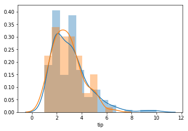
Another way to compare two or more categories is with a boxplot.
Here, we can answer our third question without having to rearannge the
original data.
In [32]:
sns.boxplot(x = "smoker",y = "tip", data = tips )
Out[32]:
<matplotlib.axes._subplots.AxesSubplot at 0x1a12547080>
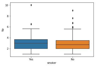
This is a visual display of the data produced by splitting on the smoker
category, and comparing the median and quartiles of the two groups. We
can see this numerically with the following code that chains together
three methods: groupby(groups smokers), describe(summary
statistics for data), .T(transpose–swaps the rows and columns of
the output to familiar form).
In [33]:
tips.groupby(by = "smoker")["tip"].describe()
Out[33]:
| count | mean | std | min | 25% | 50% | 75% | max | |
|---|---|---|---|---|---|---|---|---|
| smoker | ||||||||
| Yes | 93.0 | 3.008710 | 1.401468 | 1.0 | 2.0 | 3.00 | 3.680 | 10.0 |
| No | 151.0 | 2.991854 | 1.377190 | 1.0 | 2.0 | 2.74 | 3.505 | 9.0 |
In [34]:
tips.groupby(by = "smoker")["tip"].describe().T
Out[34]:
| smoker | Yes | No |
|---|---|---|
| count | 93.000000 | 151.000000 |
| mean | 3.008710 | 2.991854 |
| std | 1.401468 | 1.377190 |
| min | 1.000000 | 1.000000 |
| 25% | 2.000000 | 2.000000 |
| 50% | 3.000000 | 2.740000 |
| 75% | 3.680000 | 3.505000 |
| max | 10.000000 | 9.000000 |
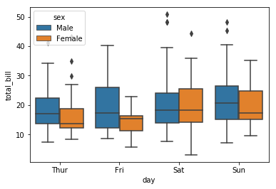
What days do men seem to spend more money than women? Are these the same as when men tip better than women?
In [36]:
sns.boxplot(x = "day", y = "total_bill", hue = "sex", data = tips)
Out[36]:
<matplotlib.axes._subplots.AxesSubplot at 0x1a12646d30>
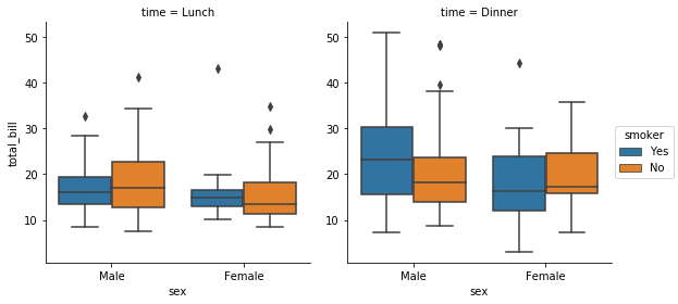
To group the data even further, we can use a factorplot. For
example, we break the plots for gender and total bill apart creating a
plot for Dinner and Lunch that break the genders by smoking categories.
Can you think of a different way to combine categories from the tips
data?
In [37]:
sns.factorplot(x="sex", y="total_bill",
                  hue="smoker", col="time",
                  data=tips, kind="box")
Out[37]:
<seaborn.axisgrid.FacetGrid at 0x1a12769c18>
Playing with More Data
Below, we load two other built-in datasets; the iris and titanic
datasets. Use seaborn to explore distributions of quantitative variables
and within groups of categories. Use the notebook and a markdown cell to
write a clear question about both the iris and titanic datasets.
Write a response to these questions that contains both a visualization,
and a written response that uses complete sentences to help understand
what you see within the data relevant to your questions.
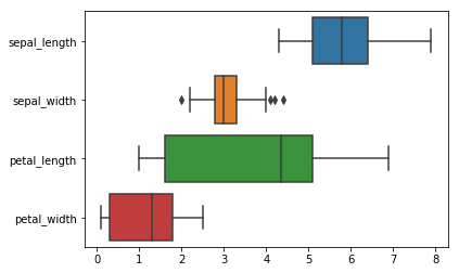
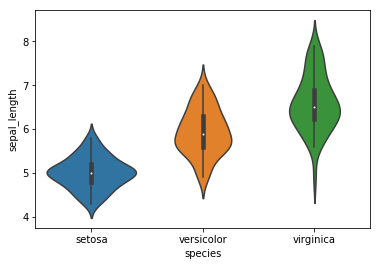
Iris Data Dataset with information about three different species of
flowers, and corresponding measurements of
sepal_length, sepal_width, petal_length, and petal_width.
Titanic Data Data with information about the passengers on the famed titanic cruise ship including whether or not they survived the crash, how old they were, what class they were in, etc.
In [38]:
iris = sns.load_dataset('iris')
In [39]:
iris.head()
Out[39]:
| sepal_length | sepal_width | petal_length | petal_width | species | |
|---|---|---|---|---|---|
| 0 | 5.1 | 3.5 | 1.4 | 0.2 | setosa |
| 1 | 4.9 | 3.0 | 1.4 | 0.2 | setosa |
| 2 | 4.7 | 3.2 | 1.3 | 0.2 | setosa |
| 3 | 4.6 | 3.1 | 1.5 | 0.2 | setosa |
| 4 | 5.0 | 3.6 | 1.4 | 0.2 | setosa |
In [40]:
sns.boxplot(data=iris, orient="h")
Out[40]:
<matplotlib.axes._subplots.AxesSubplot at 0x1a12a7d6a0>
In [41]:
sns.violinplot(x=iris.species, y=iris.sepal_length)
Out[41]:
<matplotlib.axes._subplots.AxesSubplot at 0x1a128e9fd0>
In [42]:
titanic = sns.load_dataset('titanic')
In [43]:
titanic.head()
Out[43]:
| survived | pclass | sex | age | sibsp | parch | fare | embarked | class | who | adult_male | deck | embark_town | alive | alone | |
|---|---|---|---|---|---|---|---|---|---|---|---|---|---|---|---|
| 0 | 0 | 3 | male | 22.0 | 1 | 0 | 7.2500 | S | Third | man | True | NaN | Southampton | no | False |
| 1 | 1 | 1 | female | 38.0 | 1 | 0 | 71.2833 | C | First | woman | False | C | Cherbourg | yes | False |
| 2 | 1 | 3 | female | 26.0 | 0 | 0 | 7.9250 | S | Third | woman | False | NaN | Southampton | yes | True |
| 3 | 1 | 1 | female | 35.0 | 1 | 0 | 53.1000 | S | First | woman | False | C | Southampton | yes | False |
| 4 | 0 | 3 | male | 35.0 | 0 | 0 | 8.0500 | S | Third | man | True | NaN | Southampton | no | True |
In [44]:
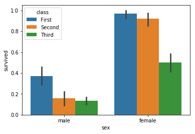
sns.barplot(x="sex", y="survived", hue="class", data=titanic)
Out[44]:
<matplotlib.axes._subplots.AxesSubplot at 0x1a12cf9cc0>
In [45]:
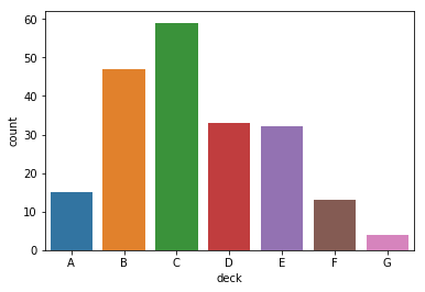
sns.countplot(x="deck", data=titanic)
Out[45]:
<matplotlib.axes._subplots.AxesSubplot at 0x1a12ce0358>